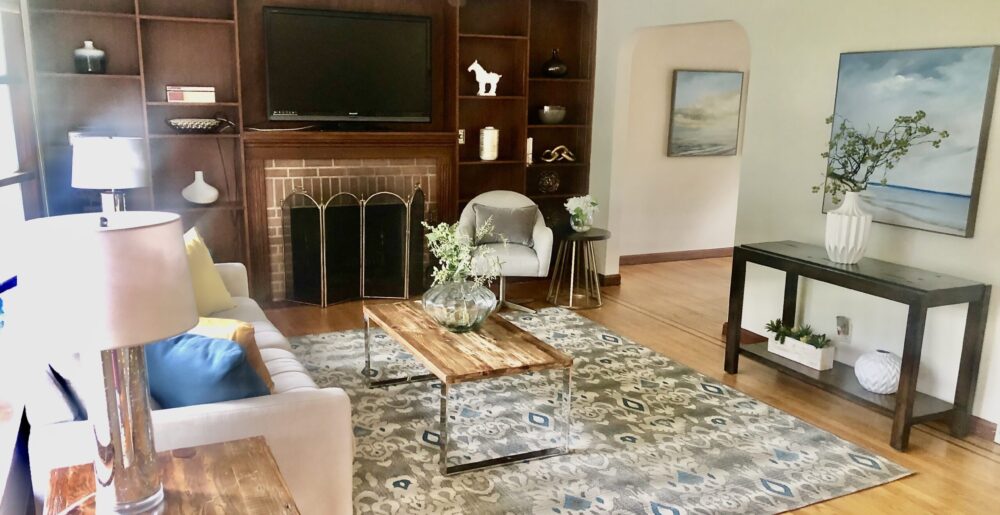
EVERY property can benefit from staging, and for those who prefer to do-it-yourself and save money, or get a jump-start on the work that needs to be done BEFORE hiring a stager, here are some easy things you can do on your own (although bringing in a friend with good design sense and a fresh pair of eyes helps):
1) Get rid of all of the paperback books in your bookcases, and 50% of the hardcovers, and the clothes in your closet, so that it looks like your house has plenty of room for storage. Place books on opposite sides of the shelves; a few laid flat adds interest. Then add a few well-chosen decorative boxes, vases, or decorative items (metal or glass “balls” on a small tray or decorative plate work well) to a few of the cleared-out shelves.
2) De-clutter all surfaces, including countertops, tables, nightstands, dressers, and vanities. Remove ALL personal-care products, including toothbrushes, hairbrushes, make-up, shampoo bottles, and the like. Hide all cleaning products, ESPECIALLY toilet brushes — ugh — under sinks. Get your grout cleaned or re-done if necessary. Think clean and spare.
3) Get rid of furniture — just about every house has too much furniture in each room, because we all collect too many pieces, which then make rooms look crowded and unappealing. Do you have any large furniture blocking selling points, such as windows, fireplaces, niches? Move them out. If you have mis-matched small pieces, move them out to give the room a more cohesive look.
4) Are your couches and chairs from the 1970s or 80s? Are they worn, soiled, or heavily patterned? Solid-colors are more pleasing and less distracting, so buy slipcovers (SureFit.com has a great selection) and re-cover any patterned pieces. This one step alone can make a BIG difference in how a room looks (see photo).
5) Have your carpets cleaned or replaced — look at them with a critical eye and think about whether YOU would be turned off by the same carpeting that wasn’t yours in someone else’s house.
6) Remove all wallpaper other than grasscloth, or very subtle parchment-looking paper, or accent-wall paper that follows current trends — check design magazines for what is “in.” If you don’t know, it’s probably not current enough to leave.
7) Remove heavy or dark drapes, or outdated window treatments such as flowery balloon valances. Simple and modern are best, or nothing at all, to let in the light and views. If your views are less-than-desirable, use sheers and/or a large vase with branches artfully placed to help hide the view.
8) Update your lighting! Way too many bathrooms I see have the 60s movie-star bare round bulbs that scream “out-of-date.” Then take a look at your ceilings — are the fixtures uninspired, cheap, small? Replace with more dramatic lighting that looks substantial and fits the style of your house. Retro is fine if there’s anything else retro in the room to make it all go together.
9) Buy fresh new bedding and towels that are for “display only” while you sell. Fold down the bedspread at night to keep it looking fresh and neat. Add lots of pillows — at least two sets of regular pillows, one set of shams, and a bolster. The pillows should pick up the bedding color(s) but have contrast as well.
10 Finally, add pop and pizzazz with new and dramatic faux flowers in contemporary vases (Pier 1 has a great assortment of floor and table vases in many looks); a couple of trees or plants to add warmth and liveliness to rooms and draw the eye towards a window with a great view, or to another focal point like a fireplace; white or colorful pillows and throws — either pick up colors that are in the rest of the room, such as in the drapes, or use the hot colors such as gray, white, or yellow, if they go with the rest of your furniture or bedding.
Happy staging and selling!

