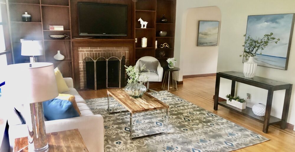
The trend for 10+ years now in staging has been to neutralize colors and decor, but the pendulum is starting to swing the other way now — color in moderation SELLS because it invokes emotional responses in buyers. Blah beige became so pandemic, it stopped serving the purpose of avoiding strong, bright, dated looks in homes that turned off buyers. Instead, it started to become too boring and dull. So adding “shots” of color — red (although somewhat over-used, it effectively draws the eye to a home’s features and warms up a room), turquoise and lime green (perfect for summer stagings), yellow and orange (more “warm” colors that give a sense of energy to a space) — in pillows, art, and accent pieces, and painting walls in deeper browns, blue-gray, sage or pale green, or even muted yellows, has started to become more popular. Follow the color trends — gray or warm beige walls or furniture paired with yellow, turquoise, blue, green-yellow, lime green, or orange are popular looks — to enliven rooms with energy or joy OR to evoke feelings of calm and restfulness in bedrooms and bathrooms especially. Stagers know what colors are currently “in” so that homes look fresh and updated to buyers. One word of caution: Color trends hit the East and West Coasts first, but take a little longer to catch on in the mid-West.
Stagers also know what colors work best with what houses, both in terms of continuity from the outside in, the style of the home, and the fixed items that can’t be easily or inexpensively changed, such as countertops, cabinets, flooring, fixtures. Most stagers are educated in understanding undertones and color combinations that work well together. So don’t be afraid of using (the right) colors to evoke positive responses in your target buyers! Continue reading
