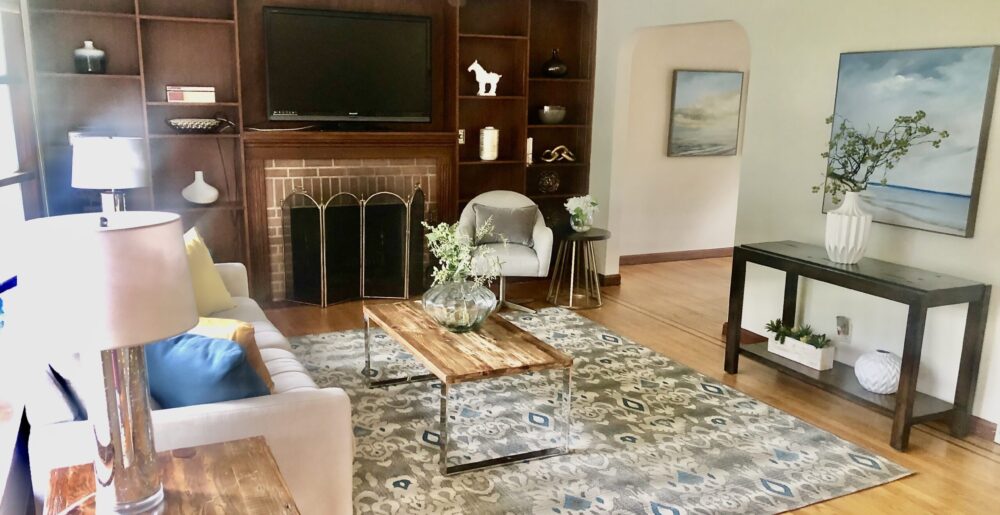
I’ve seen too many modern houses — and some not-so-modern — that are painted all-white, have loads of white cabinets, white ceramic floors, and the only other colors tend to be stark black cabinets or furniture, or pink-veined countertops or bathroom tile. While neutralizing colors can be a very good thing, when you go the other direction with huge expanses of stark white walls and floors, the effect leaves most buyers out in the cold. In this case, I recommend warming up a few select rooms, such as the living room, kitchen, and master bedroom, with warm or cool tones chosen to coordinate with any other existing colors or features (brick or stone fireplace walls, for instance) or furniture. Beiges, gray-greens, toned-down soft yellows, or the currently popular pale gray colors often work well, depending on other elements in the room. Part of my role as a stager is to bring fan decks and help you, the seller, choose the “right” colors that appeal to buyers and work in your home and lighting.
Warmth can also be increased with the right lighting choices, as well as adding colorful textiles, such as area rugs and accent pieces, including pillows, throws, florals, vases, candles and holders, and other decorative items, which I can purchase for you, with you, or you can rent from my inventory on a monthly basis.
Here’s to creating a warm, inviting home that makes buyers feel at home!
Category Archives: Active Rain
Make Your Lighting Shine!
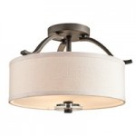
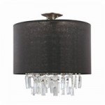
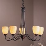 A common
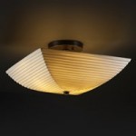
 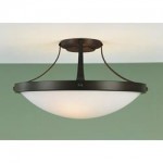 problem I see in clients’ homes is outdated lighting, both on the exterior front and inside. Updating your lighting makes a big difference in how your home looks, whether for selling or staying. Ceiling fan lights are prevalent in 80% of the homes I see, and although I don’t have a problem with them if they reflect current styles — dark blades, contemporary, sleek, simple shades — I always seem to run into the “blonde” ones with the elaborate, fluted shades that are straight out of the 80s. If you haven’t changed out your lights in 15 or 20 years, it’s time to think about doing so, especially if you’re selling. Semi-flush lights are generally more stylish than flush dome lights these days. Avoid brass finishes and go for black or bronzed “iron” looks, chrome or matte nickel finishes instead.
New, attractive ceiling lights can be purchased for anywhere from around $25 to hundreds of dollars (try Bellacor Pro online to check out a huge selection).
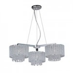
Replace Colonial style chandeliers with contemporary drum styles, elegant beaded styles, traditional classic shaded lamp chandeliers, or Mediterranean looks instead. Fit the chandelier to your dining room furniture and, to a lesser degree, house style. Don’t forget to upgrade wall sconces as well, again eliminating any Colonial bare bulb looks.
Another major lighting faux pas that I see very often is the movie-star bare bulb look around vanity mirrors. That look dates any bathroom by several decades. It can be easily updated with simple frosted down-light sconces (check out Restoration Hardware for some classic looks). If you have fluorescent “box” lights in your kitchen, upgrade to either recessed lights or small track lights on curved chrome tracks. Be sure to use the maximum wattage bulbs allowed for your fixture to make your house look light and bright to buyers.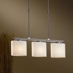
Stage Before Listing!
A prospect asked me this week if staging before listing is better than the other way around — absolutely! There are at least 4 good reasons why:
1) Get your home looking its best before you invite the agents to tour your home and do their comparative market analysis (comps), and it is very likely they will come back with a higher listing price.
2)Agents will be more excited about listing and showing your home, because a well-presented home out-shines its competition and gets buyers excited about living there!
3) The photos your agent takes of your home will look much better once it is staged. For proof of this, take a look at random MLS photos of houses for sale in your area, and think about which houses YOU would want to see based on those photos. I’ve seen far too many terrible photos of rooms crowded with furniture, outdated wallpaper and paint colors, messy bathrooms and kitchen counters, rooms with the blinds and curtains closed, tons of family photos and toys scattered about, and unmade beds or tired-looking bedrooms that need that luxury “spa-like” touch to avoid turning off buyers. Between 80 and 90 percent of buyers look at MLS photos before contacting an agent, and if your home’s photos aren’t as beautiful as they could be, most buyers will move on to the next property without even asking to look at your home.
4) Stagers are the experts in knowing what to do; agents may know the bare-bone basics, but they aren’t going to spend hours “fixing” your home’s problems, and most don’t know just HOW to solve the problems anyway. Stagers have the design background or “eye” and a large inventory of accessories that will add the pizzazz most homes need — like jewelry adds the sparkle to an outfit — and we also can handle renting furniture for you when necessary.
5) Better late than never: If your home has already been on the market with no offers or only low-ball offers, it’s never too late to stage to renew interest and get those offers coming in! Remember, the cost of staging is always less than the cost of a price reduction!
Make Sure Your Home’s Photos Don’t Scare Off Buyers!
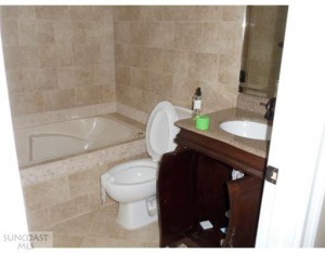
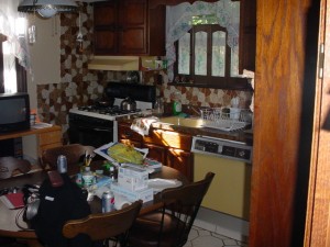
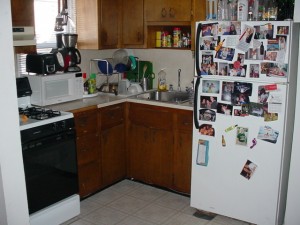
A few pics I’ve seen recently on the MLS have made me cringe . . . and I’m pretty sure they do the same to buyers!
My first thought is: Would you want to BE in these rooms, let alone LIVE in them? Shouldn’t the goal of photos of any house for sale be to pique the interest of buyers, not scare them off? Home sellers need to be told to clean up and de-clutter. If they don’t, the agent must warn them that their house is not going to get the calls and the traffic it should, since it’s well-known that 90% of buyers today search the internet to find the houses they want to see before they call an agent.
And, if you’re an agent taking photos, pay attention to what you’re taking photos of! Always take a good hard look at them on your computer screen: often, you will notice a lot more drawbacks in a photo than you did “in real-life.”
Although with these photos, it’s hard to imagine NOT seeing how bad the rooms look when you’re standing in them!
A few basics before you snap shots:
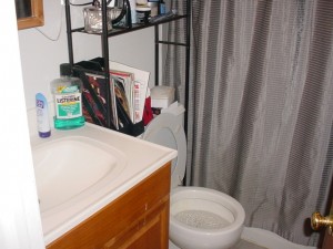
1) Toilet seats should always be down; bath mats removed.
2) Remove personal hygiene and cleaning products.
3) Take down family photos.
4) Remove all that clutter, including pet dishes, beds, and toys.
5) If you have towels anywhere, make sure they’re hung either neatly on a towel rack or rolled up next to a Jacuzzi, not left lying on the floor, draped over a shower curtain rod, etc. And make sure they look clean!
6) Speaking of towels, remove all dishtowels – they just never look classy, plus they look like clutter and remind buyers of work (hey, does this place even have a dishwasher?)
7) Remove laundry/clothes/shoes that are visible in open areas. Stow away in baskets and hampers that are out-of-sight in closets or under vanities.
8) Clear floors of all small items.
9) Beds need to be MADE, pillows fluffed, and there should be at least two layers of pillows to make the bed look comfortable. Do not pull bedspreads over the pillows — pillows belong on top, and a throw or a luxurious blanket folded across the bottom will really make the bedroom inviting.
10) Move everything off the fridge and on top of it.
11) Pare down your kitchen counter appliances to an essential one or two, such as the coffee maker and toaster. Remove knives as well.
12) Remove unhealthy-looking or tiny plants. Remove fish bowls (and other containers with little critters) from kitchens and bathrooms, especially, and make sure there are no pets or people in your photos.
13) Make sure no furniture is blocking any windows — the more light the better, and especially if you have attractive views, you want to show them off!
14) Put all lights on in every room, open all curtains and blinds, and bring in fresh flowers for the dining room table and kitchen table. If you have a fireplace, light it to really draw buyers’ eyes to this special feature.
Let your MLS photos put your home’s best features forward to attract the most buyers possible!
A Little Paint, Please!
Have you ever walked into a room painted purple or cheese-doodle orange and felt your stomach lurch? Bad paint colors (or a bad paint job) can turn off buyers as fast as you can say “ugh” and slows down the sale of your home. What do unusual colors convey to you? Probably that it’s someone else’s strange taste and a highly personal choice — never good when you’re trying to get buyers to see themselves living in your home. Poor color choices can even reduce the price you get for your home. It’s amazing how many buyers will see ugly walls as a real problem, instead of realizing how relatively inexpensive (especially if you do it yourself) and easy a fix it is.
A fresh coat of paint makes such a big difference in appealing to buyers and updating the look of your house if your current colors are:
* vivid
*unusual
* include stenciling, sponge-painting, or other out-of-date styles
* feature unusual designs (pop-art circles painted on walls, for example)
* OR if you have wallpaper! Most wallpaper and all borders are out of style and really date a home’s decor, except in the case of a feature/accent wall that has paper or grasscloth or linen-look textured covering.
According to Benjamin Moore, current “in” colors are gray and purple, (personally, I’d stay away from purple), but beige, sage green, and off-white are always popular and safe colors that appeal to buyers. Yellow and orange are popular accent colors in accessories such as vases, art, and pillows. Happy decorating to SELL!
Stagers do NOT cover up defects!
According to Barb Schwarz, founder of stagedhomes.com, an on-line article recently appeared stating misconceptions about what stagers do and don’t do. The article stated that stagers purposefully cover up problems in homes for sale. According to Schwarz, “the article further described how agents specifically should caution prospective buyers when they see a Staged home, and that ‘82% of buyers are likely to be distracted from important issues when they go through a staged home . . . 51% of respondents noted that staged homes often cover up real defects including structural damage.'” ASPs (Accredited Staging Professionals) do NOT cover up defects in properties, and hopefully other stagers who want to stay in business do not to this either. It goes against our code of ethics.
Rather, our job is to highlight the positive features of a property through furniture placement, window coverings (or lack of), bringing in up-to-date accessories, and adding artwork or area rugs to “warm up” a space and create focal points. Yes, we also aim to draw a buyer’s attention away from things like a less-than-desirable view, awkward layouts, small rooms, and old appliances or fixtures, if the owner doesn’t want to spend money on updating the latter. A very big part of our job when we visit clients is to point out everything that needs repair, replacing, painting, and modernizing. It is, of course, up to the client to decide whether they want to spend the money and/or time on that, but I strongly encourage them to.
Fortunately, I have been quite successful in convincing my clients to make needed repairs — I find clients who want me to do stagings are motivated sellers who want to sell quickly and get the most money they can for their property, so they are anxious to eliminate problems and potential buyer objections before their homes go on the market.
However, if I had a home where the floorboards were water stained (or urine stained from pets), I would never cover up that floor with a rug; instead, I would tell the sellers they must get the floor sanded down and restained, or replaced as necessary, because if the house got inspected after a contract was signed — or worse, got to closing and the buyers discovered stained floorboards after a rug was removed — both I and the sellers would be accused of hiding a defect. I would never risk my reputation for a temporary “fix” that is really a cover-up. I would, in fact, make sure the agent and the sellers knew of the problem by putting it in writing to both and keeping a copy in my own files.
My job is to help buyers view a house in its best possible light so that drawbacks that can’t be changed (view, noise, layouts, room sizes) are less obvious, but those that CAN be fixed and that might affect the value of a property are eliminated or made known to agents, sellers, and buyers. Just as with agents, stagers know that misleading buyers is a dangerous business that can get any of us in big trouble and hurt our reputations and referrals. It’s not worth it, and it’s just not the right thing to do.
Beware! The Top 20 Tacky Staging Techniques
Couldn’t agree more! Wish I’d thought of writing this list myself. One thing more I would add: don’t ever tie up towels with ribbons, no matter whether they’re brand-new or not — it just looks fake and “stage-y”! Great post, Angela!
Via Angela Voss (Designology Home Staging and Publishing):
Home staging should show off the great features of your listing and diminish the negative ones, not create a phony atmosphere. It’s all about marketing that feeling of the good life and what is possible for the room without going overboard.
A home should never look like it’s been staged.
20 Tacky Techniques:
- Napkins stuffed in wine glasses (Creates a phony atmosphere.)
- Place settings on a table or bar (Nothing says, “This home has been staged”, more than dishes, stemware, silverware, and napkins.)
- Old bath towels hanging on a bar with ribbon (Old towels will not give a buyer the spa feeling, even with a ribbon.)
- Single piece of artwork on a wall with nothing else in the room (Buyers will only see the art and not the room, especially online.)
- Furniture store tags on items that are for sale (Staging should be about the house and not what furniture is being sold by a store.)
- Old, dirty rugs (Rugs should only be used to define space or add color. Buyers need to see the floors and what they are buying.)
- Dusty, plastic trees with only a few branches (I don’t mind trees, but they have to look nice.)
- Cuttings from bushes and branches brought inside (Will wilt rapidly, and it will take the eyes away from the room.)
- Accessories that have nothing to do with the style of the home (Example: You can’t take a country look and put it in a contemporary house.)
- A card table with a sheet covering it in a dining room (A cheap look and does not represent the room dimensions.)
- Plants or greenery over window treatments (Shows off bad decorating, and again takes the buyer away from the overall room.)
- Plastic patio furniture inside that is covered or not (Just don’t!)
- Cheesy old lamps (Get the granny lamps out.)
- Cheap plastic flowers (What I like to call “forever flowers” usually found at dollar stores.)
- Sofa covered with a sheet as a slipcover (Planning on painting anytime soon?)
- Blow-up beds (From personal experience: blow up beds will only stay fully inflated for a short time no matter how expensive they are.)
- Plastic fruit (Fruit can be done right, but the majority of the time it looks tacky, creating a phony atmosphere.)
- Breakfast tray on a bed with tumbled wine glasses (Creates a phony atmosphere.)
- Only two chairs in a living room (This will not give a buyer a sense of the space.)
- Wine bottle sitting on the edge of a garden tub (Creates a phony atmosphere.)
Tacky staging can spell disaster for your listing. Why? Because we remember tacky! What you put in the home is the perception of what the value of the home is worth. Your poorly staged listing becomes, “That house with the saggy, deflated blow up bed,” or “That place with the cheesy lamp like the one in my parents’ house.”
If the accessories and furniture looks like you got it out of grandma’s attic or down the street at a yard sale, the buyer could expect a yard sale price tag on the house. It is better to leave a house empty then to use bad décor! Staging should enhance the architecture of the home, not show off poor decorating ideas. Bad staging draws attention to itself – and distracts your buyer from your listing!
Please understand the quality of a good home stager. Know what services you are having your seller buy and who you are recommending. They will be worth their weight in gold.
Helping you get your listing SOLD,
Angela Voss
Designology Home Staging
