How to Choose Paint Colors that Work for YOUR Home

According to the Staging and Design Network, “Color is the core of every beautiful room. Yet, it is also the place where more than 60% of design and staging mistakes are made.” I’d bet that we’ve all walked into homes – or seen rooms on-line – where the colors just don’t work with the finishes in the rest of the room, such as the cabinets, countertops, or floors, or where the colors are too intense or too pale and washed out for the amount of light the room gets. Sometimes you can’t even figure out exactly what is wrong with the way the room feels, it just seems “off”, as in these cases:

Paint colors work best when they pick up another color already in the room -- or go with a neutral instead.

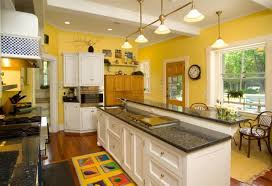
Lemon yellow walls are jarring with the white cabinets and brown countertops.

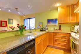
lime green walls don’t work with the yellow-orange of the cabinets

This red accent wall is just too abrupt of a change from the adjacent white wall and is disconcerting to the eye, even though the owners have tied in the red in the throw and a couple of pillows. Red drapes and red in the rug would tie it together much better.

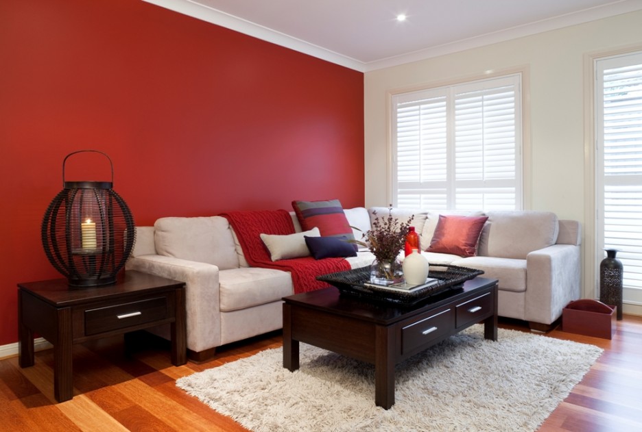
Red accent wall doesn’t work

A search of Houzz.com, the popular design and decorating website, reveals there are about 326,000 conversations about picking the WRONG paint color! Paint company commercials often show this dilemma in a humorous way, with homeowners putting a dozen colors or many shades of a similar color on their wall, and puzzling for hours or even days over what looks best. But it’s not really funny for most homeowners when you spend hours of your valuable time looking through paint chips and painting sample colors on your walls, and then you’re still not sure what color works best with your home’s hard finishes or furniture and rugs and bedding. Interestingly, while there are thousands of paint colors and shades of colors, only about 100 of them are used 85% of the time, according to Benjamin Moore.

This is especially true if you are not familiar with the undertones that exist in almost all colors – including neutrals and whites, which can have yellow undertones (the creamy whites), or blue or gray undertones (the cool whites).

Some of the factors that need to be considered when choosing paint colors:
* shade
* saturation
* undertones
* lighting

* sheen of paint
* what works with the hard finishes in the rooms (cabinetry, flooring, countertops)
* what complements the soft finishes such as furniture, rugs, window treatments
* style and exterior of home

Spending $100 to $200 on a paint color consultation from a color/design expert (depending on size of your house and how many colors you need or want), is an inexpensive investment that can actually save you time and money in preventing color mistakes – even having to repaint entire rooms, which can run several hundred to $1,000 to correct just one mistake.

A designer with color training can eliminate all the “wrong” colors that won’t work with your space, finishes, furniture and lighting, and help you choose what colors look best. She or he is also up to date on styles and color trends, especially important if you plan to sell anytime in the next few years. What colors you are drawn to are important, but what’s more important is avoiding colors that don’t work with what else is in the room. A color consultant will also suggest color flow from one room to another, especially in open plan homes.

Here are some rooms that work better:

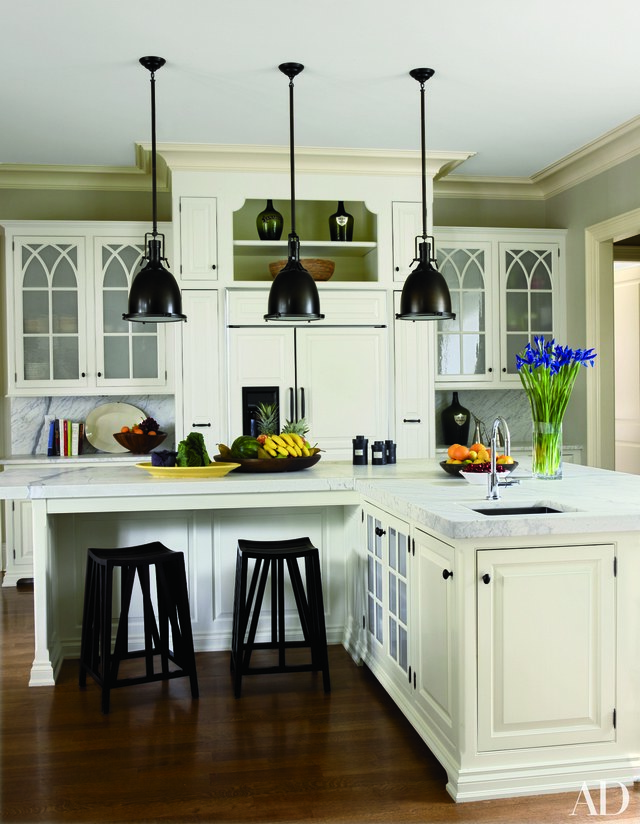
The gray walls pick up on gray in the countertops for a sophisticated and coordinated look. Notice the crown molding trim color is an atypical choice, but keeps the focus on the detailing of the upper cabinets below.

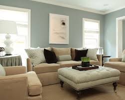
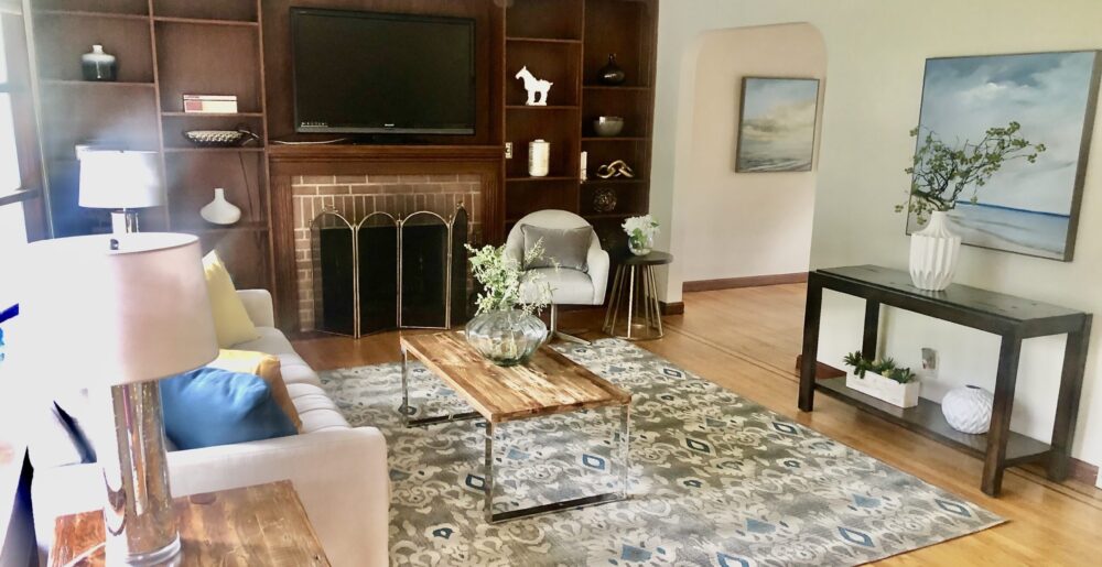
soft colors with muted undertones work well

lime green walls take center stage, but are grounded by pairing with beige, brown and white to keep the overall effect cohesive.

Tip: Remember to always put up a sample sheet or color on different walls in your room and look at it over 48 hours in different lighting throughout the day. Colors that look pale in a sunlit room will look a little darker and more saturated at night. Paint chips need to be looked at vertically as they will be in the home (or horizontally for floors or decks) Many homeowners forget that when they are looking at paint chips in stores, the lighting is typically fluorescent which has a blue cast. It’s best to look at any samples outdoors or – best of all – in your own home.

How I Help You Find Your Design Style

A design client just told me that when her sister-in-law came over to see her finished home, she was amazed with how well my furniture and accessory selections matched her style. That’s not an accident or a lucky guess (well, maybe once in a while!). But before I even meet with a client for an initial consult, I email a design questionnaire that helps to pinpoint their preferred style. Then when I visit their home, I ask questions about what rooms they like best, least, what colors they prefer or more importantly, DON’T like at all. If they’re not sure what their style is (and many people aren’t), I look for other clues, such as their taste in clothes, scenes in family photos, interior design photos they’ve pulled or pictures I show them, what their favorite stores are (home stores or even fashion stores), how they like to entertain (IF they like to entertain!). I also do a fun “design quiz” using a paint color deck to see what colors clients are drawn to.
This forms the basic “style recipe” that serves as the starting point for putting together design boards and furniture selection. As a decorator, I then add in a little “spice” to the mix with creative and new selections available from to-the-trade stores to see how a client responds to something a bit out-of-the-box for that “wow” factor. The goal is design that makes clients happy!

Choosing the Right Accessories

Various accessories contribute to the traditional feel of this living room

Bright red pillows and vase add much-needed color

accessories such as a plant, mercury glass vase, and decorative balls add color

A bright-white ginger jar and decorative tray with silver shells

A white orchid is always in style in just about any room.

Mercury glass is a trendy and glamorous addition to a bedroom

In decorating or staging to sell, accessories are the finishing touch in any room, the “icing on the cake” if you will, meant to add interest, warmth, texture and often, color, in order to create that indefinable “wow” factor that makes a room look truly pulled together. Here are some basic principles for choosing accessories:
1) Less is more. A well-designed room should not look cluttered, and too many items are distracting and irritating to the eye. If you do have a collection of many items you want to display, group them together, or in a couple of different areas, and if you put them on a coffee table, use a tray to corral them in a grouping to create a more dramatic effect.
2) Large items create more of an impact than small ones. Little items lack drama and contribute to the cluttered look, something design is meant to eliminate! Large-scale art or several smaller pieces of art grouped together are more dynamic and striking than small pieces, especially in large spaces and over large pieces of furniture. Ditto with larger sculptures (think Buddha heads, animal head sculptures, etc.) and with floral arrangements, decorative bowls, boxes, etc.
3) Make sure your accessories and art fit the scale of the room — large rooms or high-ceilinged rooms call for larger pieces of art so the art doesn’t end up looking under-sized.
4) Numbers count! Arrange items in uneven numbers, which are more pleasing to human eyes. Use 1, 3, or 5 items, occasionally even 7 (as with decorative balls in a large bowl or vase). Of course, a pair of lamps flanking a sofa or bed or a pair of candlesticks flanking a mantel add symmetry and balance, just be careful not to make everything a matching pair, which will look monotonous.
5) If your room is monochromatic, mix in some texture (beehive vases, seagrass baskets, dimpled glass or variegated or oddly-shaped ceramics, fluffy pillows or a shag rug) or punches of color with accessories to prevent the room from looking boring. Don’t forget to vary interest with different materials, such as metals or organic materials in an all-wood and glass room, for instance, or by bringing in pattern to a monochromatic or pale-colored room.
6) Continue the color scheme or theme of the room by selecting accessories with at least one color already in the room, or jazz up a low-key look with a totally new color, but use multiple pieces in that color for flow. For example, if you have a blue, brown, and white room, consider adding a complementary color such as red in several items to really enliven the room and attract the eye to key features, like a fireplace or handsome coffee table.
7) Plants or organic materials, such as twig trays, wooden boxes, or woven baskets, always add warmth that makes rooms look more comfortable. If you don’t like florals or even plants, consider adding a collection of different sizes or colors of glass or pottery vases (stick to one type) or ceramic or seagrass balls to achieve a similar effect. Another inexpensive and easy way to add warmth and coziness is to bring in books. You can use a coffee table book or stack 2-3 attractive hardcover books on a coffee or end table. Or arrange a few hardcover books between bookends on a console table, or group them in several horizontal and/or vertical arrangements on bookshelves.
8) You can “shop your home” for accessories that might be stored in your basement or attic (or your glassware cabinets), create dramatic ones using basic materials such as clear vases or urns filled with colored beads, flowering branches, decorative balls, pinecones, seashells, etc., or shop for inexpensive accessories at stores such as HomeGoods, Marshalls, TJ Maxx, Pier 1, West Elm, Pottery Barn, Target, Walmart, or KMart.

Adding white pillows and decorative plants and a box add warmth to this formerly “blah” room.

Designing a Model Home

This week, I finished a model home project for an active adult community in Montville, NJ (Briar Hill at Montville). It was a lot of work from inception through staging day(s), but also fun. When designing for a model home, you need to consider the age and lifestyle needs of your target market (in this case, upscale 55 years old up to around 80 years old, but with the majority of buyers likely to be in their 60s); the geographic area (upper middle class country/suburban in northern NJ); and the timeframe for getting the project done (originally about 5-6 weeks, extended to 10 weeks because of construction delays). I added more luxury touches with layered bedding, decorative pillows, and panel drapes, as well as valances in the dining area (drapes would be too formal for this eat-in area, the only dining area of the home). I chose oriental and classic acorn/fleur-de-lis area rugs to convey a traditional, classic look, but I went with transitional mid-century furniture to avoid the stodgy, out-dated look seen in many older active adult communities. The curved tables in the hall and living room, as well as the rounded edges of the dining room table, give a sense of relaxation and softness appropriate to a retirement community.

Dramatic front entry hall.

Light-filled living room with cathedral ceiling.

Kitchen island and prep area.

Luxurious master bedroom suite.

I also selected many of the finishes in this home — the ebony stain on the floors, the oil-rubbed bronze light fixtures in the main living areas, the granite, carpeting, and paint colors. The goal was to convey elegance and relaxation.