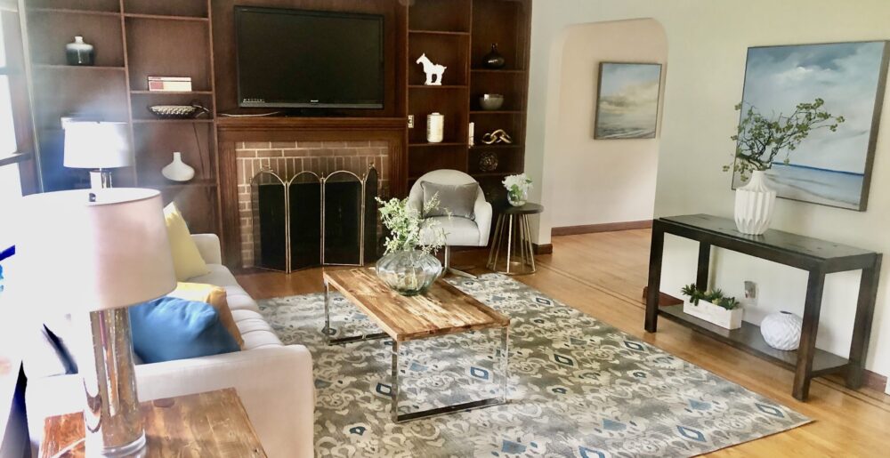
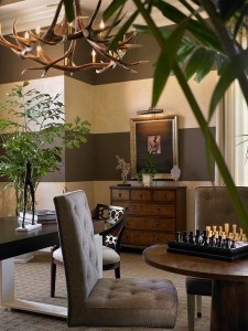
Various accessories contribute to the traditional feel of this living room

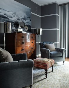
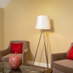
Bright red pillows and vase add much-needed color

accessories such as a plant, mercury glass vase, and decorative balls add color

A bright-white ginger jar and decorative tray with silver shells

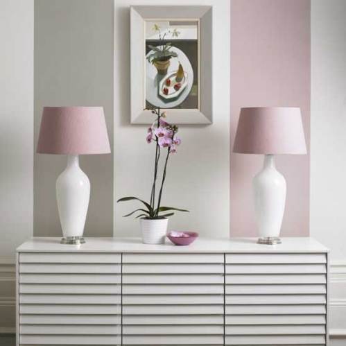
A white orchid is always in style in just about any room.

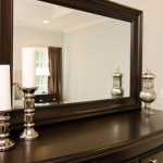
Mercury glass is a trendy and glamorous addition to a bedroom
In decorating or staging to sell, accessories are the finishing touch in any room, the “icing on the cake” if you will, meant to add interest, warmth, texture and often, color, in order to create that indefinable “wow” factor that makes a room look truly pulled together. Here are some basic principles for choosing accessories:
1) Less is more. A well-designed room should not look cluttered, and too many items are distracting and irritating to the eye. If you do have a collection of many items you want to display, group them together, or in a couple of different areas, and if you put them on a coffee table, use a tray to corral them in a grouping to create a more dramatic effect.
2) Large items create more of an impact than small ones. Little items lack drama and contribute to the cluttered look, something design is meant to eliminate! Large-scale art or several smaller pieces of art grouped together are more dynamic and striking than small pieces, especially in large spaces and over large pieces of furniture. Ditto with larger sculptures (think Buddha heads, animal head sculptures, etc.) and with floral arrangements, decorative bowls, boxes, etc.
3) Make sure your accessories and art fit the scale of the room — large rooms or high-ceilinged rooms call for larger pieces of art so the art doesn’t end up looking under-sized.
4) Numbers count! Arrange items in uneven numbers, which are more pleasing to human eyes. Use 1, 3, or 5 items, occasionally even 7 (as with decorative balls in a large bowl or vase). Of course, a pair of lamps flanking a sofa or bed or a pair of candlesticks flanking a mantel add symmetry and balance, just be careful not to make everything a matching pair, which will look monotonous.
5) If your room is monochromatic, mix in some texture (beehive vases, seagrass baskets, dimpled glass or variegated or oddly-shaped ceramics, fluffy pillows or a shag rug) or punches of color with accessories to prevent the room from looking boring. Don’t forget to vary interest with different materials, such as metals or organic materials in an all-wood and glass room, for instance, or by bringing in pattern to a monochromatic or pale-colored room.
6) Continue the color scheme or theme of the room by selecting accessories with at least one color already in the room, or jazz up a low-key look with a totally new color, but use multiple pieces in that color for flow. For example, if you have a blue, brown, and white room, consider adding a complementary color such as red in several items to really enliven the room and attract the eye to key features, like a fireplace or handsome coffee table.
7) Plants or organic materials, such as twig trays, wooden boxes, or woven baskets, always add warmth that makes rooms look more comfortable. If you don’t like florals or even plants, consider adding a collection of different sizes or colors of glass or pottery vases (stick to one type) or ceramic or seagrass balls to achieve a similar effect. Another inexpensive and easy way to add warmth and coziness is to bring in books. You can use a coffee table book or stack 2-3 attractive hardcover books on a coffee or end table. Or arrange a few hardcover books between bookends on a console table, or group them in several horizontal and/or vertical arrangements on bookshelves.
8) You can “shop your home” for accessories that might be stored in your basement or attic (or your glassware cabinets), create dramatic ones using basic materials such as clear vases or urns filled with colored beads, flowering branches, decorative balls, pinecones, seashells, etc., or shop for inexpensive accessories at stores such as HomeGoods, Marshalls, TJ Maxx, Pier 1, West Elm, Pottery Barn, Target, Walmart, or KMart.

Adding white pillows and decorative plants and a box add warmth to this formerly “blah” room.