Choosing the Right Accessories

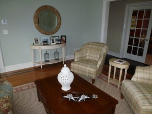
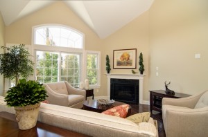
Various accessories contribute to the traditional feel of this living room

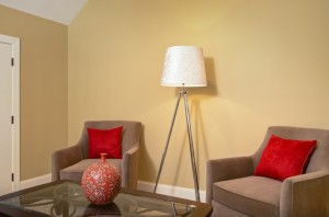
Bright red pillows and vase add much-needed color

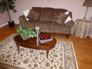
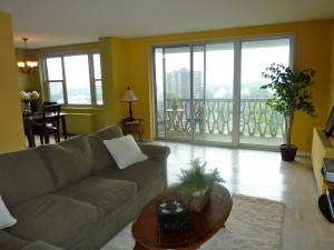
accessories such as a plant, mercury glass vase, and decorative balls add color

A bright-white ginger jar and decorative tray with silver shells

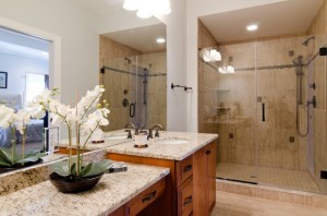
A white orchid is always in style in just about any room.

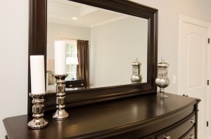
Mercury glass is a trendy and glamorous addition to a bedroom

In decorating or staging to sell, accessories are the finishing touch in any room, the “icing on the cake” if you will, meant to add interest, warmth, texture and often, color, in order to create that indefinable “wow” factor that makes a room look truly pulled together. Here are some basic principles for choosing accessories:
1) Less is more. A well-designed room should not look cluttered, and too many items are distracting and irritating to the eye. If you do have a collection of many items you want to display, group them together, or in a couple of different areas, and if you put them on a coffee table, use a tray to corral them in a grouping to create a more dramatic effect.
2) Large items create more of an impact than small ones. Little items lack drama and contribute to the cluttered look, something design is meant to eliminate! Large-scale art or several smaller pieces of art grouped together are more dynamic and striking than small pieces, especially in large spaces and over large pieces of furniture. Ditto with larger sculptures (think Buddha heads, animal head sculptures, etc.) and with floral arrangements, decorative bowls, boxes, etc.
3) Make sure your accessories and art fit the scale of the room — large rooms or high-ceilinged rooms call for larger pieces of art so the art doesn’t end up looking under-sized.
4) Numbers count! Arrange items in uneven numbers, which are more pleasing to human eyes. Use 1, 3, or 5 items, occasionally even 7 (as with decorative balls in a large bowl or vase). Of course, a pair of lamps flanking a sofa or bed or a pair of candlesticks flanking a mantel add symmetry and balance, just be careful not to make everything a matching pair, which will look monotonous.
5) If your room is monochromatic, mix in some texture (beehive vases, seagrass baskets, dimpled glass or variegated or oddly-shaped ceramics, fluffy pillows or a shag rug) or punches of color with accessories to prevent the room from looking boring. Don’t forget to vary interest with different materials, such as metals or organic materials in an all-wood and glass room, for instance, or by bringing in pattern to a monochromatic or pale-colored room.
6) Continue the color scheme or theme of the room by selecting accessories with at least one color already in the room, or jazz up a low-key look with a totally new color, but use multiple pieces in that color for flow. For example, if you have a blue, brown, and white room, consider adding a complementary color such as red in several items to really enliven the room and attract the eye to key features, like a fireplace or handsome coffee table.
7) Plants or organic materials, such as twig trays, wooden boxes, or woven baskets, always add warmth that makes rooms look more comfortable. If you don’t like florals or even plants, consider adding a collection of different sizes or colors of glass or pottery vases (stick to one type) or ceramic or seagrass balls to achieve a similar effect. Another inexpensive and easy way to add warmth and coziness is to bring in books. You can use a coffee table book or stack 2-3 attractive hardcover books on a coffee or end table. Or arrange a few hardcover books between bookends on a console table, or group them in several horizontal and/or vertical arrangements on bookshelves.
8) You can “shop your home” for accessories that might be stored in your basement or attic (or your glassware cabinets), create dramatic ones using basic materials such as clear vases or urns filled with colored beads, flowering branches, decorative balls, pinecones, seashells, etc., or shop for inexpensive accessories at stores such as HomeGoods, Marshalls, TJ Maxx, Pier 1, West Elm, Pottery Barn, Target, Walmart, or KMart.
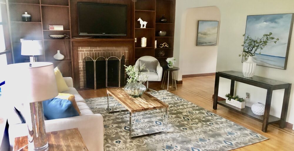
Adding white pillows and decorative plants and a box add warmth to this formerly “blah” room.

Wall Color Makes A Difference, Staging or Decorating!

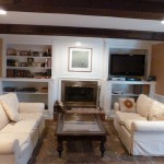
In this home, just changing the color on the walls from dark red to light gold grasscloth wallpaper made a big difference! This room only has light on the northeast side from French doors into a sunroom, so the red made the room cozy but dark, especially considering the beamed ceiling. The homeowner also lightened and brightened this room with new recessed lights, and we will likely be adding 3 lamps (combo of table and floor) later. Now this room looks more sophisticated and would be more appealing to buyers as well.

Too dark room

Color Lightens Room

Light Gold Grasscloth Brightens Room

Re-Use, Re-Fresh with One-Day Makeovers

If you’re looking for an inexpensive and easy way to refresh and revive your home to make the most of your space, a one-day makeover is a great solution! First, I’ll interview you by phone about your goals, style, favorite colors, and anything that bugs you about your space, and then make an appointment to come see your house and assess it in person. Depending on what we discuss and decide about your space, I will give you a list of suggestions such as new paint colors or adding crown moldings, new drapes, slip-covers, bedding, etc., and/or I can start re-arranging furniture, art, accessories, rugs, etc. right on the spot to make your home “feel” better. This is a great, inexpensive option that typically costs less than a nice weekend away and results in a house you’ll be happy to show off AND come home to!


Get More Money When You Sell

Sellers who invest even just a few hundred dollars in getting their homes staged and prepared for the market typically get back at least 4-5 times that investment in a higher sales price. As in most areas of life, it takes money to make money! Of course, repairs, deferred maintenance, and cleaning and painting must be done for staging to make sense. If there’s truly not enough money in the budget to do both, repairs and cleaning take precedence.
That being said, staging is “visual merchandising” of your home and you must emotionally detach from your home in order to prepare it as a product for sale that will appeal to the most buyers. I’m happy to explain to homeowners about WHY I move or remove furniture, change out artwork and accessories, update bedding and pillows, etc. — it’s not about how you live when it’s time to sell, it’s about how your home should look to help grab buyers’ attention in a positive way. The better your house looks, the more interest it will generate from buyers and agents, and the more offers it will bring in — as long as the price is in line with comparable properties. Your agent will do that research and can guide you to set the right price — in this market, setting a high price almost always backfires to your home sitting months, even years, on the market. It’s better to set the price right at market price — or even slightly lower — right at the start of listing in order to stir up huge interest and possibly a bidding war.
Presentation and price always go hand-in-hand in a down market.

Make Your Lighting Shine!

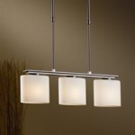
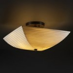
A common problem I see in clients’ homes is outdated lighting, both on the exterior front and inside. Updating your lighting makes a big difference in how your home looks, whether for selling or staying. Ceiling fan lights are prevalent in 80% of the homes I see, and although I don’t have a problem with them if they reflect current styles — dark blades, contemporary, sleek, simple shades — I always seem to run into the “blonde” ones with the elaborate, fluted shades that are straight out of the 80s. If you haven’t changed out your lights in 15 or 20 years, it’s time to think about doing so, especially if you’re selling. Semi-flush lights are generally more stylish than flush dome lights these days. Avoid brass finishes and go for black or bronzed “iron” looks, chrome or matte nickel finishes instead.
New, attractive ceiling lights can be purchased for anywhere from around $25 to hundreds of dollars (try Bellacor Pro online to check out a huge selection).
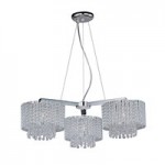
Replace Colonial style chandeliers with contemporary drum styles, elegant beaded styles, traditional classic shaded lamp chandeliers, or Mediterranean looks instead. Fit the chandelier to your dining room furniture and, to a lesser degree, house style. Don’t forget to upgrade wall sconces as well, again eliminating any Colonial bare bulb looks.
Another major lighting faux pas that I see very often is the movie-star bare bulb look around vanity mirrors. That look dates any bathroom by several decades. It can be easily updated with simple frosted down-light sconces (check out Restoration Hardware for some classic looks). If you have fluorescent “box” lights in your kitchen, upgrade to either recessed lights or small track lights on curved chrome tracks. Be sure to use the maximum wattage bulbs allowed for your fixture to make your house look light and bright to buyers.

Landscaping For Maximum Curb Appeal

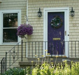
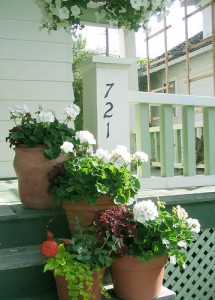
Now that spring has FINALLY (!!) arrived in North Jersey, this is the perfect time to spruce up your front, side, and backyards — including patios and decks — to improve curb appeal and maximize your selling price. A beautifully landscaped yard goes a long way towards creating outdoor ambience and a lifestyle that buyers want. The easiest and cheapest way to upgrade the look of your front entrance is with LARGE potted plants, using annuals for color that will last all summer. If the front steps or landing are small, one pot or large hanging plant will work fine. For added punch, use flowers that match a colorful front door — like purple pansies or red petunias or geraniums. Don’t forget to consider the amount of sun that the plants will need, since many front entryways tend to be shady. A good option besides impatiens or begonias are New Guinea impatiens or red ferns.
If you have a front light post or a “lemonade” front porch, dress them up by hanging one or two flowering plants (don’t overdo it).
An inexpensive and easy way to improve the look of any yard and make it look professionally landscaped is to mulch all flower beds and foundation areas, preferably with dark brown or black shredded mulch.
Dress up a patio or deck with an outdoor table and chairs or at least a bench and a potted palm or plant to show buyers your home’s entertainment potential. Add colorful cushions to make any outdoor area look more summery and inviting. Stow all tools, hoses, and toys out of sight. If you have a grill, make sure it is uncovered and looks clean, ready for grilling.

A Little Paint, Please!

Have you ever walked into a room painted purple or cheese-doodle orange and felt your stomach lurch? Bad paint colors (or a bad paint job) can turn off buyers as fast as you can say “ugh” and slows down the sale of your home. What do unusual colors convey to you? Probably that it’s someone else’s strange taste and a highly personal choice — never good when you’re trying to get buyers to see themselves living in your home. Poor color choices can even reduce the price you get for your home. It’s amazing how many buyers will see ugly walls as a real problem, instead of realizing how relatively inexpensive (especially if you do it yourself) and easy a fix it is.

A fresh coat of paint makes such a big difference in appealing to buyers and updating the look of your house if your current colors are:

* vivid

*unusual

* include stenciling, sponge-painting, or other out-of-date styles

* feature unusual designs (pop-art circles painted on walls, for example)

* OR if you have wallpaper!  Most wallpaper and all borders are out of style and really date a home’s decor, except in the case of a feature/accent wall that has paper or grasscloth or linen-look textured covering.

According to Benjamin Moore,  current “in” colors are gray and purple, (personally, I’d stay away from purple), but beige, sage green, and off-white are always popular and safe colors that appeal to buyers. Yellow and orange are popular accent colors in accessories such as vases, art, and pillows. Happy decorating to SELL!

What DOESN’T belong in this picture . . . !

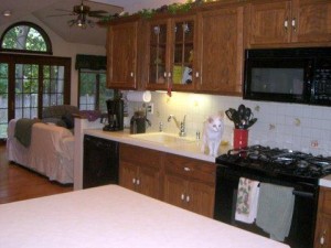
What a nicely staged home, EXCEPT for the cat walking on the kitchen countertops! Now, how did the photographer miss that?! Don’t get me wrong, I love cats, but a lot of people don’t, and even if they do, the thought of cat paw prints and cat hair floating around a kitchen isn’t exactly the appetizing thought to present to buyers “scoping” out your new listing on the MLS! Just wrote in my AR blog and website blog why “Animals and Showings Don’t Mix” and this is another one to add to the list, LOL.

cat doesn't belong on the countertop in your MLS photo!

cat on kitchen countertop

Different areas of a house need to shine in the summer!

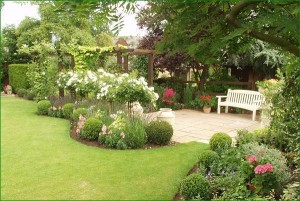
Now that warm weather is here, it’s time to emphasize all the outdoor recreation and relaxation areas of any home on the market . . . whether it’s a 7 bedroom mansion on several acres with a large in-ground pool and tennis courts, or a 1-bedroom apartment with a balcony or patio. Curb appeal becomes even more important — now’s the time to add large urns of flowering plants to front steps, porches, and all patios. Spruce up the landscaping with dark brown or black mulch (the “in” colors), flowering annuals along walkways or around lampposts and curbside mailboxes, and prune the bushes everywhere, but especially in the front of the house and alongside the foundation. If there are any “empty pockets” of missing plants, be sure to fill them in with ones that match the neighboring plants. Look to create solid “masses” of no more than two colors with annuals in the foreground of foundation plantings.
Make sure you replace any worn, broken patio furniture with new furniture that fits the style of your house — but make sure it’s on-trend in the newest colors. For instance, a Victorian house looks best with wicker furniture, but the dark resin “wicker-look” is the most popular right now. A cabin or barn-type house looks great decked out with Adirondack chairs in painted colors that match the trim on the house. Sling-back chairs with bronze or dark frames or tightly-woven rattan outdoor furniture look great with traditional colonials, ranches, or contemporary homes.
If your home has a patio with nothing on it, stage it so buyers know what it can be used for and can see how much the space adds to the entertainment value of your home. You could add not only a table, chairs, and umbrella, but a firepit, couch and coffeetable, and potted trees or plants in the patio corners. For a small balcony or patio, stage the space with a bistro table and chairs so buyers can picture themselves having a drink or coffee in this outdoor “room.”
Be sure all your outdoor lights work for buyers who might drive by at night or even visit at night — you want your home to look brightly-lit to show warmth and its features. This would be a good time to invest in some uplights at the base of focal-point trees in both the front yard and back. And if you have a worn or broken fence, get it stained, painted, and fixed! Make sure the grass is cut, and if you have a pool, keep it dive-in ready so it looks like it’s not a maintenance chore!